Lakeside Software is leading the charge into a new era of proactive IT — but their brand wasn’t keeping pace.
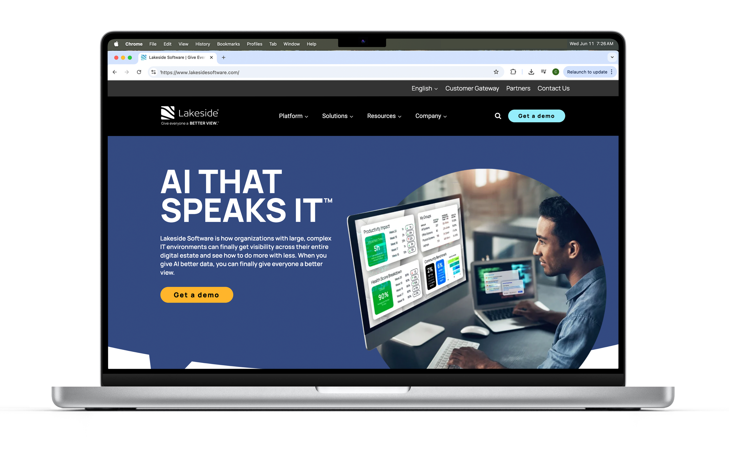
Their previous visual identity felt outdated and misaligned, with a logo that unintentionally evoked vacation rentals or retirement communities. Compounding the issue, there was no clear brand architecture to distinguish Lakeside Software as a company from SysTrack, their flagship product.
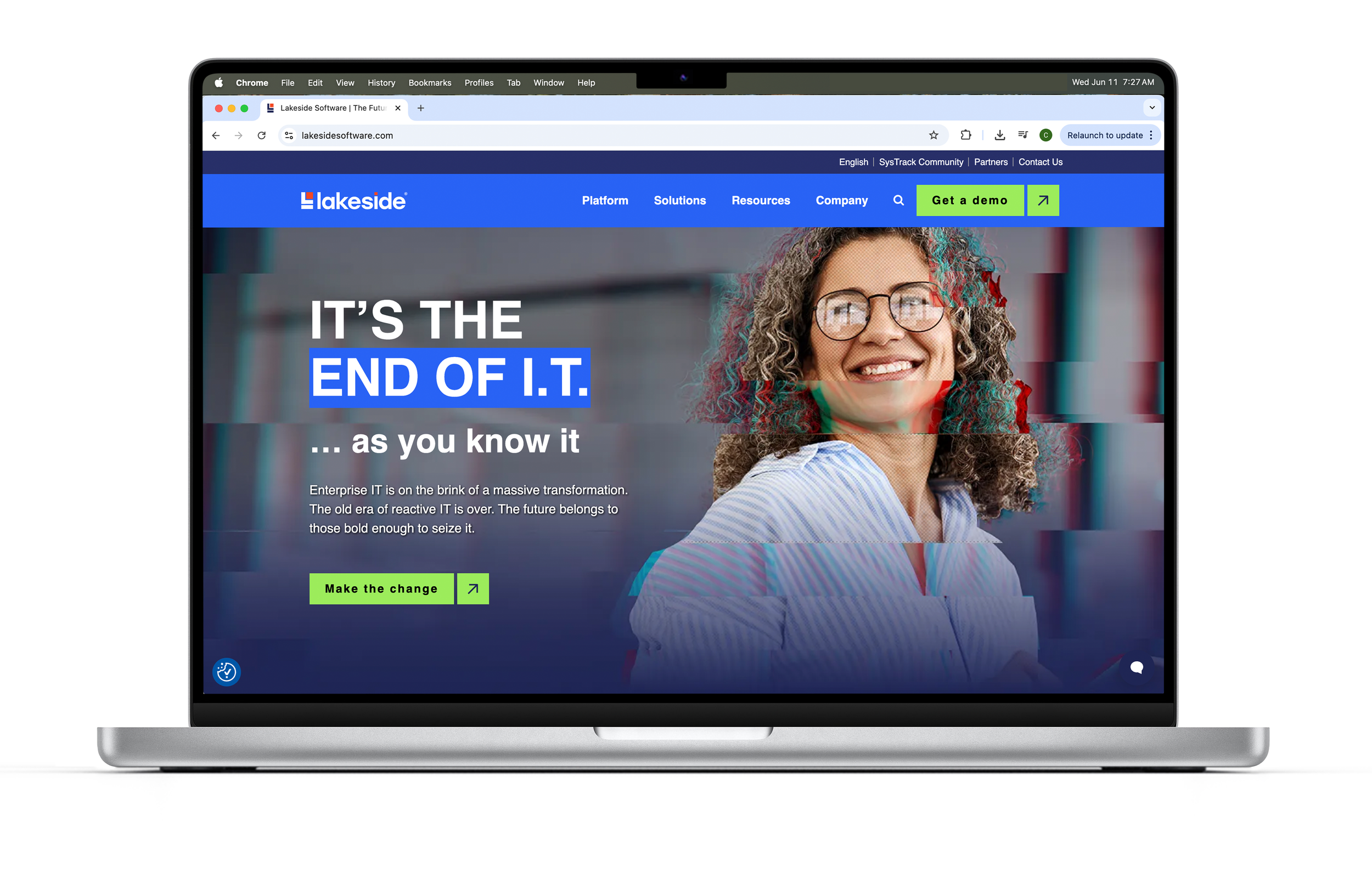
Before a new visual system could be introduced, the brand needed stronger foundational elements. We began by redefining the brand messaging — making it clear, concise, and aligned with Lakeside’s mission and vision for the future of IT. The result is a bold, clean, and modern identity that not only stands out in the enterprise space but also positions Lakeside as a forward-thinking leader ready to meet the demands of tomorrow.
Beyond the visuals, we delivered a scalable brand system that could flex across channels, audiences, and product tiers. From internal presentations to global campaigns, every touchpoint was designed to reinforce Lakeside’s position as both a visionary and a partner. The work didn’t just look good—it created alignment, built confidence across teams, and laid the groundwork for long-term brand equity.


Redefining the messaging
To build the brand, we had to first understand it. Lakeside needed stronger foundational messaging — so we stepped back to define the why, how, and what. We explored key differentiators, themes, and positioning territory to uncover a strategy that could drive not just creative, but the business itself. Before anything could look good, it had to make sense.
These early notes and sketches captured that exploration. This was where intent started to take shape: not through design, but through clarity. It’s where the brand began.
OUR WHY:
We transform IT complexity into clarity.
How We Do It:
Leverage our embedded AI engine and rich dataset to enable IT teams to proactively resolve complex issues and gives visibility across the entire digital estate.
What We Offer:
Lakeside’s flagship product, SysTrack: an endpoint monitoring platform.
WE ARE:
Trusted • Visionary • Curious• Collaborative• Bold
Redesigning the Logo
The company’s founder lived beside a lake—hence the name, Lakeside Software. The original logo paid homage to those roots with water-inspired forms. But water and tech don’t exactly mix, and the visual identity left ideal customers unclear about what the company actually offered.
The I/O Symbol
This design focuses on the flow of data—both machine-to-machine and human-machine interactions. The symbol has been rotated vertically to reduce immediate recognizability, allowing for a more abstract interpretation. The red dot at the center echoes the tittle of the “i” and transforms the “O” in I/O into a bullseye, symbolizing precision and our ability to target data.
Coding Brackets
This concept started as a “let’s throw one more on the wall” idea. The brackets form two L’s merging into an S—subtle, but intentional. They also reference one of the most universal symbols in code syntax, tying the brand back to its technical roots.
Data Abstracted
This concept emerged from exploring common symbols used to represent data. The icon is an abstract take—strong and block-like, echoing structure and solidity. The orange highlights suggest insights being extracted from raw information, bringing focus to what matters. Visually, the form mirrors elements of the typography, especially the “I,” creating cohesion between symbol and wordmark.
Rebuilding the Brand Architecture
Lakeside Software had a strong product—SysTrack—but unclear brand messaging. High-level decision-makers recognized "Lakeside," while end users were more familiar with "SysTrack," creating disconnect. Rather than renaming the company, we clarified the relationship: Lakeside SysTrack. By pairing the existing company logo with the product name, we established a consistent naming convention, improved visual hierarchy, and created a scalable system for future product branding. Simple, effective, and built for growth.


Reinvigorating the Color
The company wanted bold, high-impact color. While the original palette delivered on vibrancy, it lacked the contrast necessary for ADA compliance. We refined the system—keeping the boldness, but reducing the number of colors and creating accessible pairings that meet compliance standards without sacrificing energy.

Reframing the Photography